Stray Threads
5/25/2026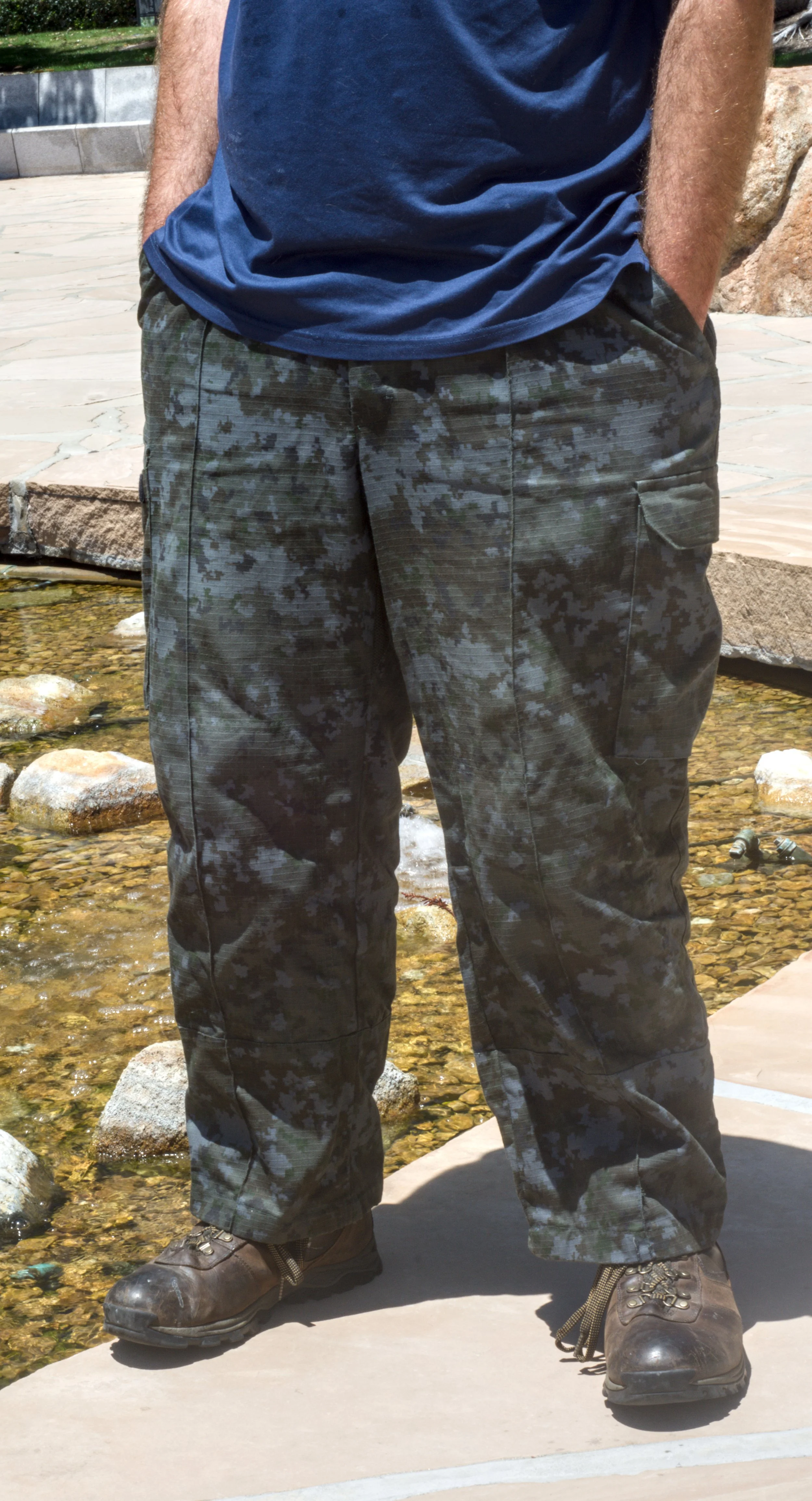
One of my favorite parts of acquiring new clothes (or any manufactured soft goods) is the prep work before they enter regular rotation. Whether it is a sling bag from REI or my Stan Rays from Slashed Denim, there is always a small finishing pass to run before a piece is ready for its intended use. Usually, that just means hunting down stray threads and trimming or melting them before they snowball into a bigger issue. But my recent exploration into workwear has pushed that process further than expected, and this latest pickup required a more considered round of tailoring before it was really dialed in.
Workwear is a broad category because work itself is broad. One corner of it I keep coming back to, both aesthetically and from a pure fit standpoint, is military fatigues. They are designed to perform across a wide range of tasks and environments, which translates into a silhouette that is genuinely utilitarian and surprisingly easy to wear. That is a relief if you grew up under the full pressure of skinny jeans, lol.
During the initial audit, I turned up a few features I genuinely appreciated, and a couple that were not going to work for my use case. The elastic cuffs on the legs are a good example of the latter. They make total sense for heavy field use, keeping debris out of your boots, but my (mostly) desk-bound day-to-day does not have that requirement. A small incision on the inside of the cuff accessed the elastic running the channel, and a box cutter took care of the rest. The elastic stays in; it just has no tension, so the leg opening drops back to relaxed. Small mod, big difference in wearability.
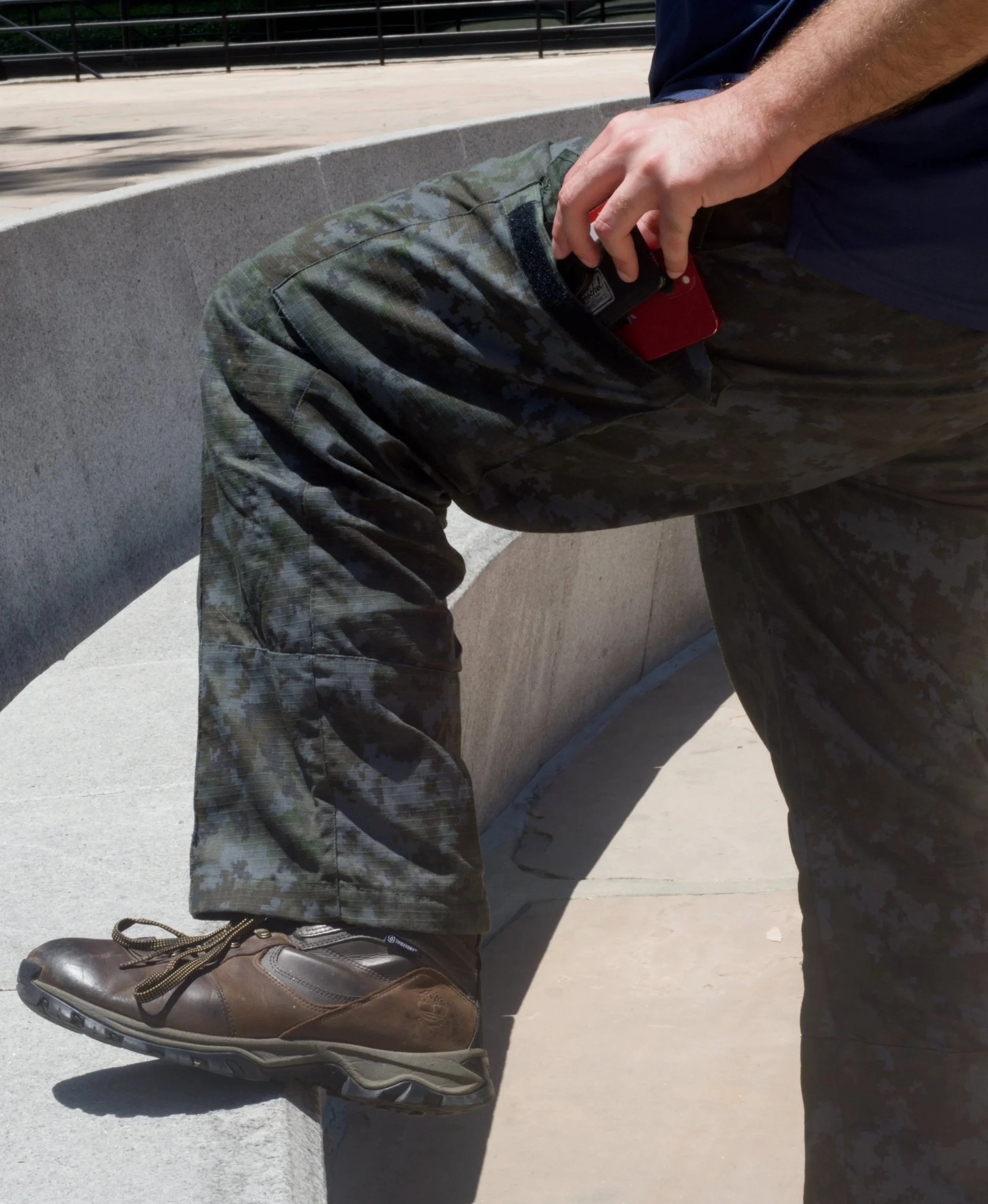
The pockets themselves are worth noting — they are genuinely massive. When I went to take photos for this I fit my Nikon D7200 in one without much effort. That is the whole camera, with my 50mm lens… It feels like having two dnd style bags of holding bolted onto my pants.
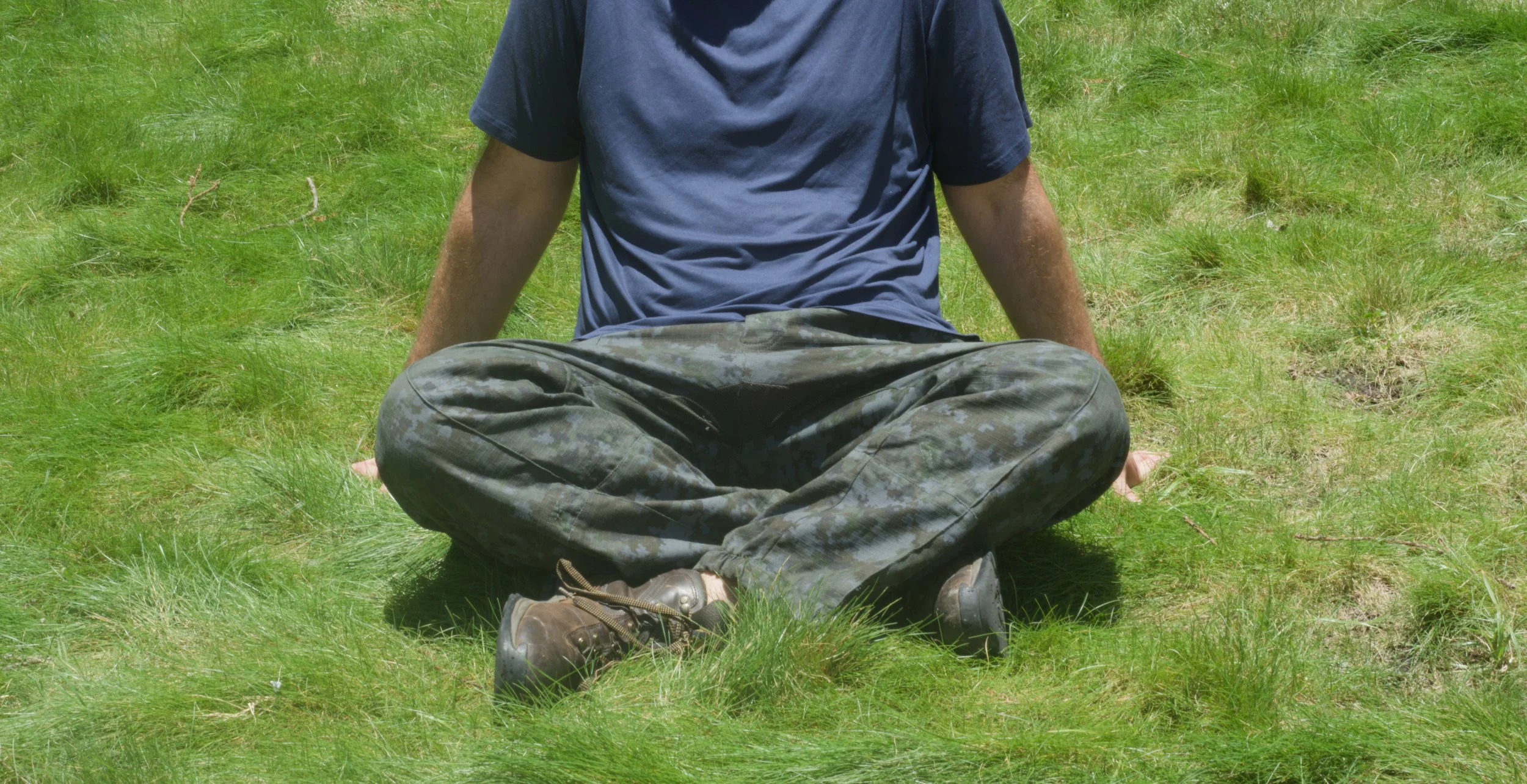
Beyond the leg details, the construction on these is equal parts good enough and fascinating. From the decent amount of stray threads to chase, ripstop fabric to arrest tears, a front leg pleat reinforced stitching at high-wear zones like the knees, and cargo pockets with full velcro closures (not the two piddly velcro patches that pass for closures on most cargo pants I have owned). All strong details. But the loudest design choice, the one doing the most talking, is the digital camo pattern. Out of the box, the colorway was olive green as the base with hits of forest green, warm brown, and black. The whole system was built around one function: breaking up your silhouette against a dense woodland environment.
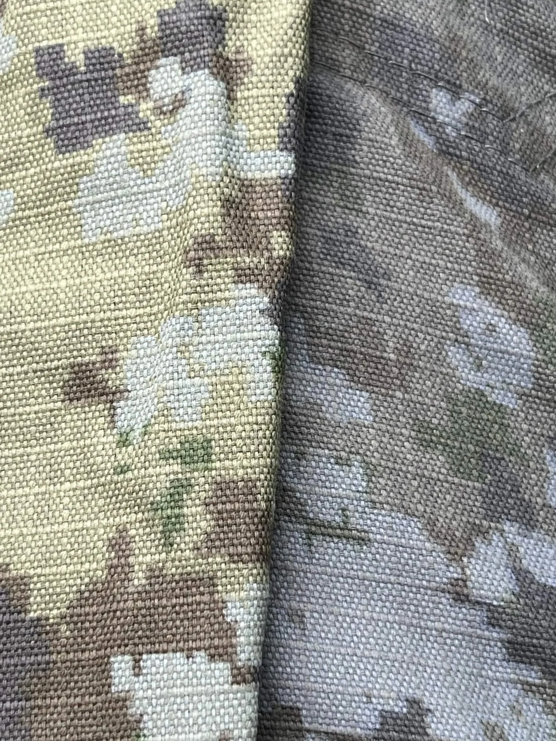
That mismatch opened up a clear intervention: dye. Navy was the only color I considered, dark enough to collapse the contrast without fully erasing the structure underneath. A 60-cup stock pot filled halfway, Rit dye and fixer run as two separate operations, a kitchen thermometer to hold the bath at the desired temperature. I did not go dark enough on the first iteration; the original woodland colorway reasserts itself under direct sunlight, but the dye did its core job: reduced the camo signal without eliminating it. Which might be the more interesting outcome anyway. (pictured here is the before/after)
Camo carries many meanings: it is a fashion staple lifted out of its original context, a symbol of resistance and a tool of oppression, sometimes at the same time, and that tension does not resolve just because you threw the garment in a dye bath. What has been interesting is tracking how it signals differently to different people now that I am wearing it daily. Some folks clocked the pattern immediately and their energy shifts toward me in ways I am not interested in. Others I feel more aligned with will inspect it, then look away quickly once they place it. I get it. I do not mind the shift in perception because I know where I stand. What I find genuinely funny, though, is that camo, a pattern whose entire design purpose is concealment, makes me feel more visible in a crowd than almost anything else I own.